
Ethel M Chocolates
Graphic Design
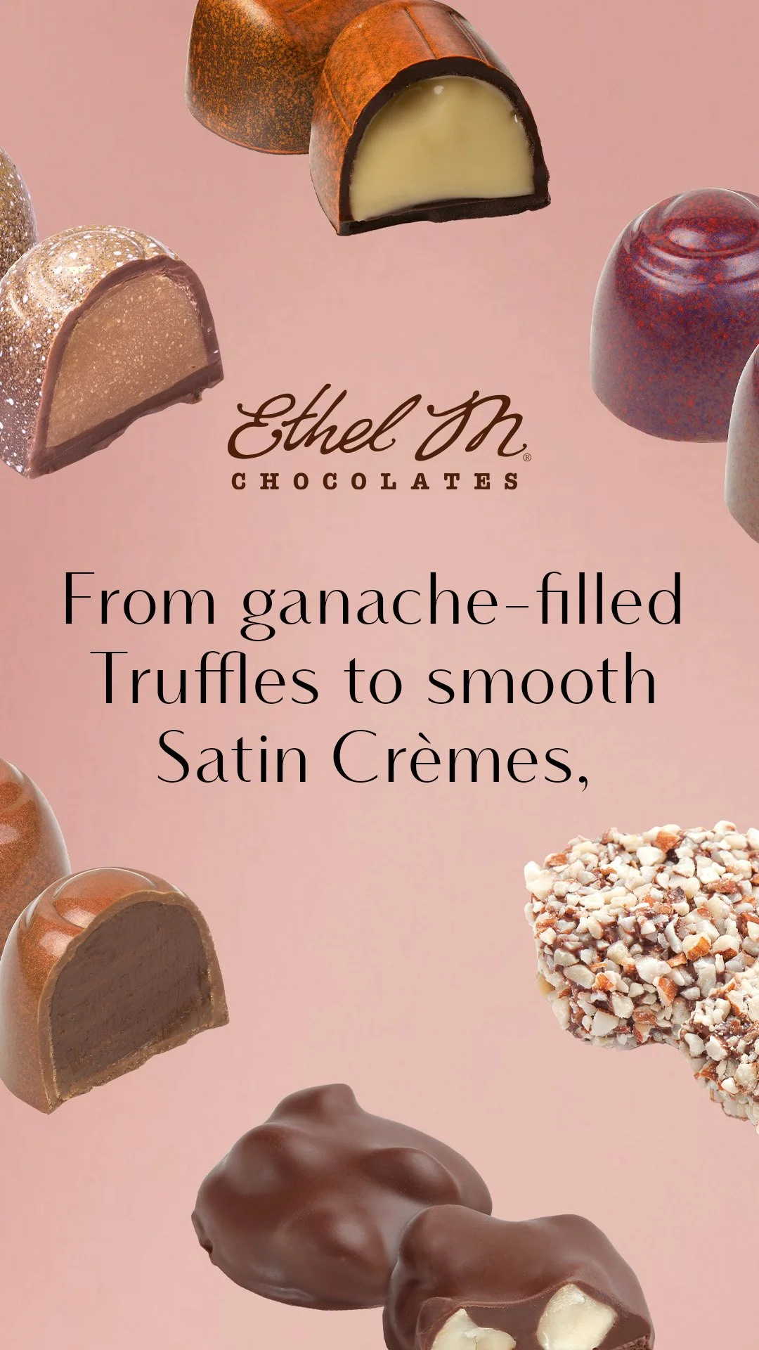
Ethel M is a distinctive premium chocolate brand operated by Mars Chocolate, renowned for its dedication to luxury and its unique inspiration of the Mojave Desert.
Behind the scenes, Ethel M's graphics pose a wide range of challenges. It entails working with limited photography, extending photos to accommodate awkward dimensions, removing outdated products, photoshopping additional props to make photos on theme, and even leveraging AI to streamline workflow processes.
The biggest takeaway from these assignments are being comfortable in Photoshop and getting a better eye for photography and graphics.
Working with Ethel M as a client, I have contributed to their rebrand and have elevated their identity further.

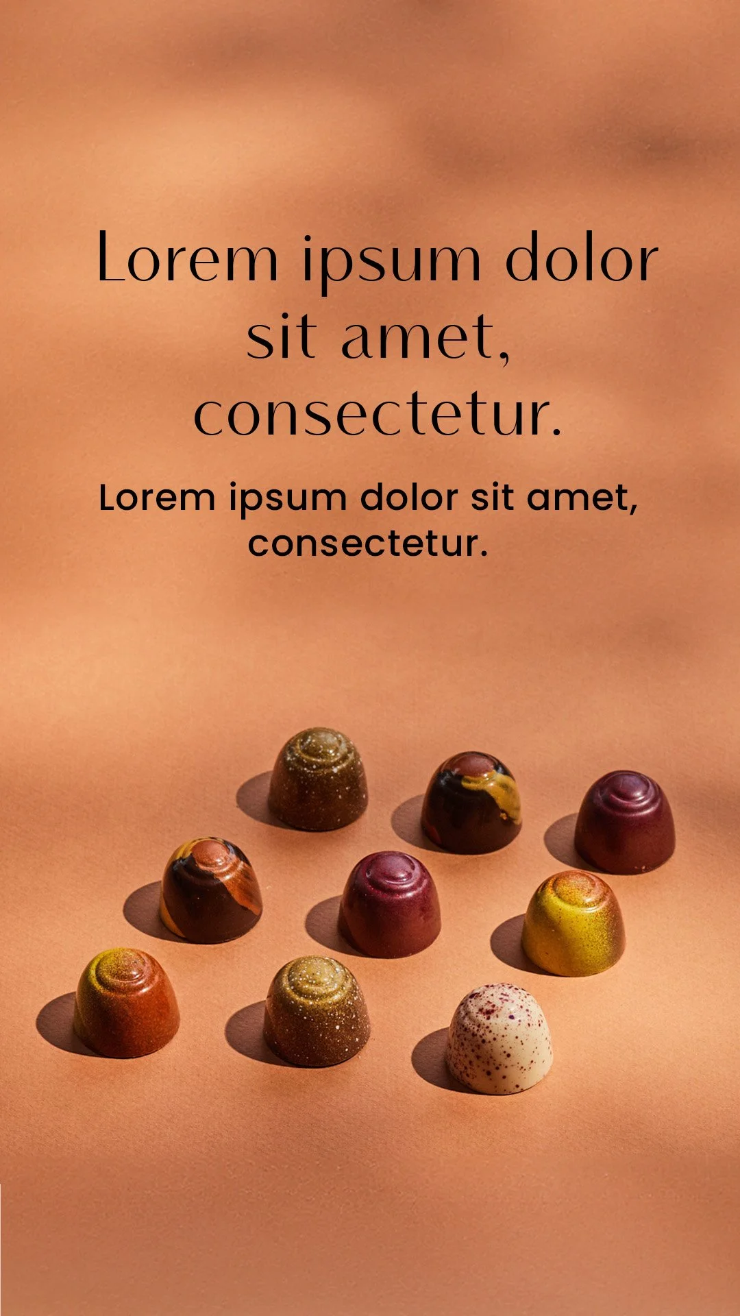
Mother’s Day Visual Guide
Ethel M sent my team new photography. My job was to take in the new art direction and determine the visual direction for Mother’s Day graphics.
I saw opportunities using dark purple, light pink, brown, and beige paired with satin and luxurious textures.
A list of composed assets that needed to be applied to emails, banners, and ads included:
color palette, photography, typography, social media templates, and a retail sign.


Applying the Visual Guide to Graphics
The visual guide was then approved and applied to all Mother’s Day assets. These graphics below are Instagram and Facebook ads.


Valentine’s Day Ads
Valentine’s Day ads were the first graphics to roll out with their new brand typeface. It made it more elevated than previous graphics.


Email and Web Banners
The emails and banners are great way to appeal to Ethel M’s consumers. The selection here needed additional edits. This could range from adding elements to match the month’s theme to even extending photos to fit the dimensions better.


