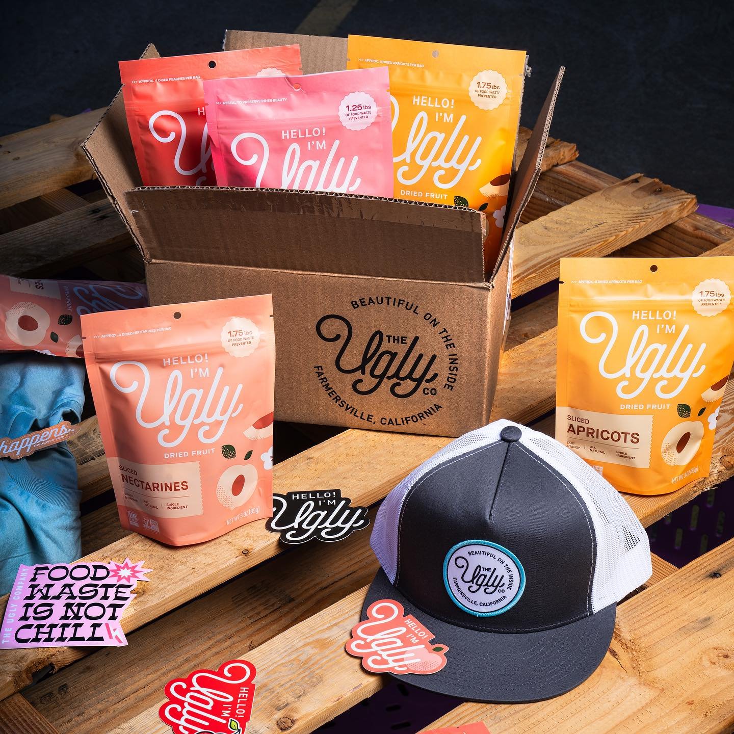
Ugly Dried Fruit Packaging
Packaging Design + Illustration
Ugly is on a mission to rescue imperfect produce, transforming it into delicious, all-natural, healthy dried fruit snacks. However, designing the packaging posed a unique challenge. When packaging various flavors or types of fruit, the team had to ensure a systematic approach. This involved careful consideration of layout, color palette, and distinguishing similar fruits. Additionally, they had to account for how the packaging would appear when the fruit was sliced versus diced.
Now available at Sprouts and featured on Good Morning America, Ugly's innovative approach to packaging highlights their commitment to sustainability and delicious, nutritious snacks.
Sliced Fruit Packaging
Ugly’s sliced packaging has a darker background with lighter elements throughout. This project is tightly systemized with the illustrations being easily interchangeable.
Kaitlyn Gupta proposed the general layout while the rest of us made tweaks, and I developed the illustrations
Diced Fruit Packaging
As you can see the diced packaging is the reverse color palette.


